The regular car buyer makes on average nine hundred digital touchpoints throughout their entire buyer’s journey before physically making it into a dealership to buy a car.
By the time they make it to the dealership the user has already moved through both the awareness and the consideration stage of the buyer’s journey, making hundreds of digital decisions, all to get to the end result of knowing which car they want to buy and where.
Sounds great doesn’t it? They spend hours doing all of the research, they come through the doors of your dealership with a car make and model in mind, hand you over the cash, you give them the keys and they drive off into the sunset.
Except - It’s not your dealership they come to. It’s your competitor’s.
Why? You have the same makes, you have the same models, you even have better prices than Tom’s Auto Dealership two streets down!
But no, they go to your competitor because your competitor was there with the buyer at every stage of the buyer's journey, in many if not most of their digital touchpoints. Your competitor might have been in the very first blog post they read, or offered them a virtual test drive once they were deciding between models. They might have been the website that best helped them compare prices or offered them expert advice in the finer details.
Your competitor guided the buyer through all of the stages by answering their thoughts, questions, and problems. And in the end, they were the dealership they chose to go with.
We covered the auto buyer’s journey in great detail in our article How Inbound Marketing Has Changed The Process Of Converting In The Automotive Industry. It outlines how, if you want to succeed in moving your potential buyers from online researchers to physical buying customers, you must use inbound marketing in all of the three stages of the buyer’s journey.
This article will instead look at how the design of your website has a huge effect on the user experience, and therefore their entire buyer’s journey and final decision stages.
If you have all the great products, offers, and advice, but the user can’t find it easily on your site then they will go elsewhere to find their answers.
You need to have a streamlined site that looks good, is easy to navigate, and will be giving any potential buyer a great user experience. If you design your site well, it will push potential buyers through the stages to becoming a buyer at your dealership.
First, let’s recap how your potential buyer makes their key decisions online before stepping into your dealership ready to buy.
Buyer Personas and Decision Factors
Before jumping into any sort of marketing you first need to know who your buyers are. What are their pain points, what are they looking for, how do they make decisions, and who are they. When you’ve got your personas nailed down well, you can start to craft a great marketing strategy
Let’s look at our buyer persona, Anna:
Anna is a 34 year old married mother of a 8 month old baby and a 3 year old toddler. Her and her husband earn mid-level but with a growing family don’t have cash to burn, however safety comes first. She works from home as a concept artist but sometimes travels to a shared office space in the city centre. Her main concern is that her current car (2004 Volkswagen Beetle) isn’t as safe as it could be for two small children. It has a lot of problems that brings her to the mechanic quite often. They also have a large dog and all like to go on day trips together at the weekend so more room would be useful as well.
Okay so that is a little bit about who Anna is as a person and what her main pain points are. Now let’s look at how she makes decisions.
Google has outlined 5 key decision moments that most car buyers will go through.

You can probably see that as the buyer moves through each of these decisions they are also moving through the buyer journey stages from awareness through consideration to decision. Being at all of those stages, answering their questions, and doing so seamlessly through design provides the user the best experience. So how do you design your website to help guide (and gently nudge) the user onwards.
How To Design For Your Buyer Personas
Now that you know who you are targeting, what exactly they are looking for and the problems they need solved, you can design your website to seamlessly provide for them at every step on their user journey from awareness, to consideration and the final push at decision.
Let's take a look at how you can design elements of your site to target each of the 5 decisions factors for Anna, and ultimately ensure that she converts with your dealership.
Which Car Is Best?
For Anna which car is best for her would typically be a car that is safe for children as that is her main concern. So she is most likely to look at blogs or articles that reference family safety in this stage of her search. She might read up on safety features that family cars should have rather than just looking at makes at models.
Goal Driven Navigation
This is a feature Carwow really nails. They create recommended lists for different personas so they can give a good selection of cars rather than have the user trawl through brands, and then types to find if they have certain specifications.

If you were thinking if terms of Anna and her persona you could create a “recommended” goal driven navigation too which articles such as “Top 5 cars for families”, “The Best Safety Features All Family Cars Should Have”. This not only allows you to target the persona but you can offer cars at different price ranges and different brands. This is the stage where the user is still open to ideas and they have a problem that they want you to solve.
Flexible Search
Many car sites have a search but only offer search by make and model or by price, this just isn't good enough. Not all users think I want a Ford or I have £300 a month to spend. Some want 7 seats some want 100+mpg and make and model just won't help with that.
Consider giving your users the option to choose how they want to refine results. Lease Fetcher is a great example of this where almost all features are searchable in a simple and clean way allowing the user to quickly find what cars are best.
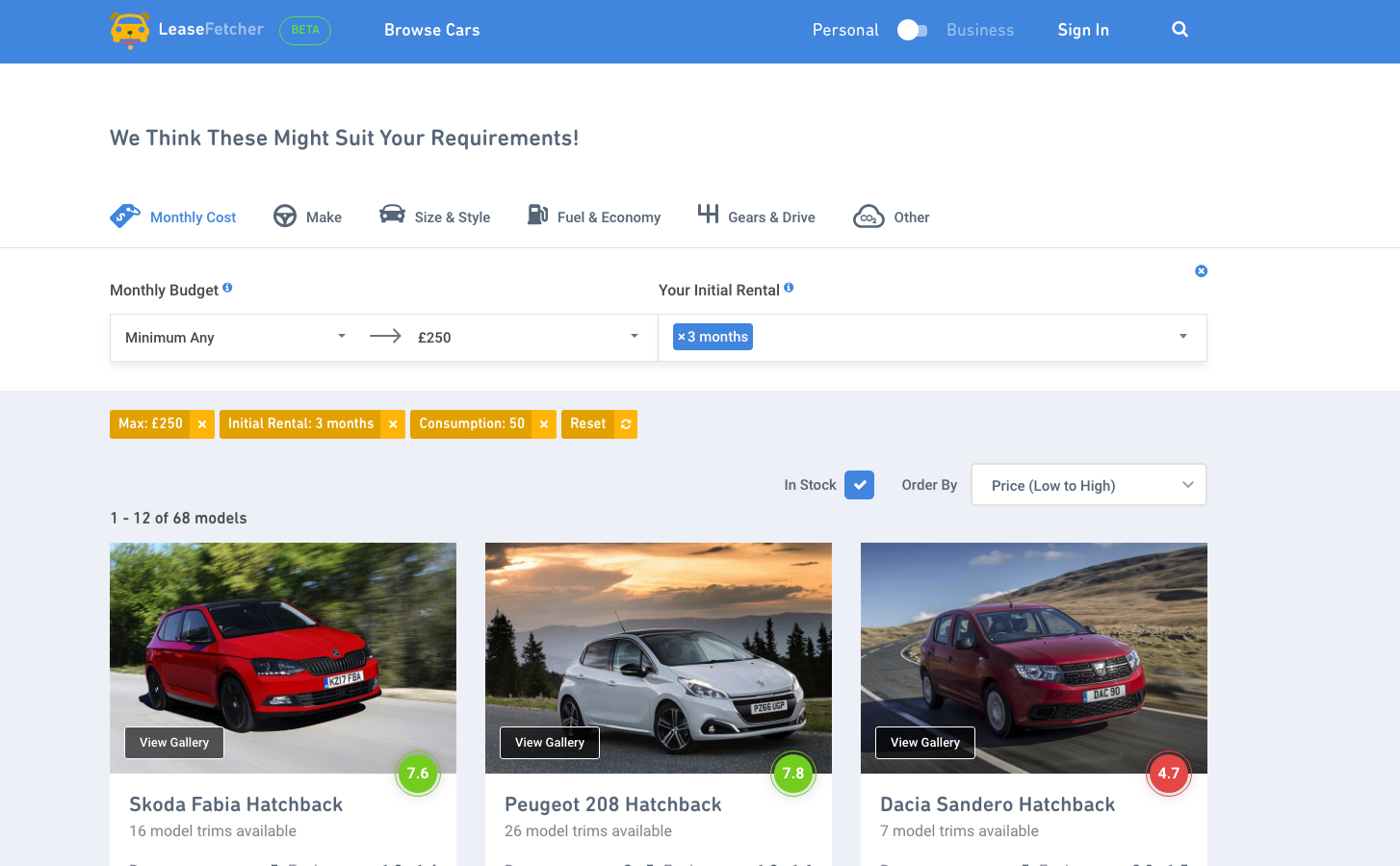
Anna for example might be looking for a hatchback within a certain budget. Giving her the option to filter to these specific requirements’ saves her a lot of time which as a user she will be grateful for and in result probably appreciate your company more.
Is It Right For Me?
This is now when Anna has discovered a nice amount of family friendly cars but now she needs to look deeper into the car specs. Is this car right for her needs and her budget? Just because one car seems best overall it might not be best for Annas specific needs, if say, it doesn’t have enough space for her entire family including the dog, and the picnic basket. She might want to compare makes and models or get recommendations based of that car.
Compare Features
If your users end up looking at lots of different cars they probably won’t be able to remember all the different specs and features. This can be frustrating if they have to continuously click in and out of different pages or open tons of tabs. To prevent this, having a compare feature is a great way to assist your users in comparing their shortlisted cars.
Arnold Clark have a little heart beside each car so you can favourite them into your shortlist to compare against one another at a later stage.
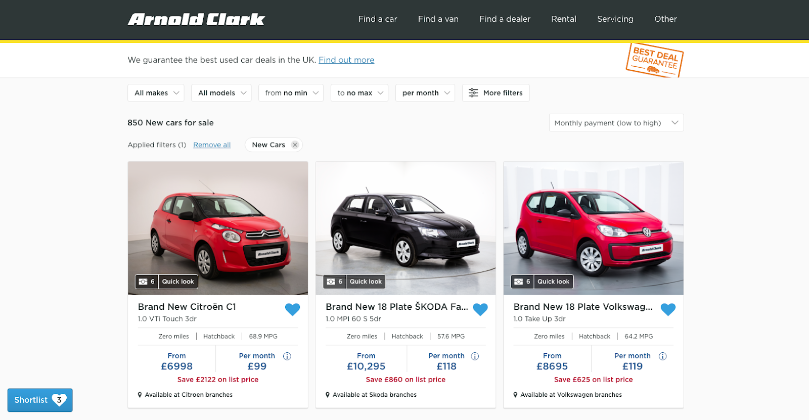
If we consider Anna wanting a 5 door hatchback she can go in and favourite the hatchbacks that also suit her budget and then she can compare things like the price, the make, the model the engine size etc.
Video reviews
This really is a must have. Almost all car buyers want to watch a video review of a car to get a better real life sense of it. So if you don’t have any videos on your site, they will look elsewhere, hopefully only to Youtube and back, but it could easily be a competitors site instead.
If you don’t have time to create your own videos you should at least embed Youtube videos directly onto the car description page as you can see from Arnold Clark’s page below.

For example, if Anna is buying a car that she wants to be safe, as well as have space for her family she might look for a video that gives a full tour of the inside of the car as well as any safety features it has that makes it suit her needs.
Independent reviews and questions
Similar to video reviews, you should consider showing independent user reviews. This has a double impact as users trust independent reviews much more than the seller reviews, and they also often answer questions that a user might have that a seller may not have thought of.
Amazon utilises this function perfectly on their product reviews as you can see below.

Personalised Virtual Tour
If your buyer is at this stage and then are liking the car but just trying to figure out if it suits their needs a virtual tour is a great way of showing them how it can.
Here’s an idea: you set up a “Request Personalised Virtual Tour” form that allows the user to fill out some of their uncertainties or questions they have about the car. You then, based of this information make a quick 5 minute virtual tour showing how the car answers their concerns.
This element is three fold: you help answer their concerns, you provide a personal touch that maybe other competitors aren’t, and you gain some of their data from the form.

Take our auto buyer persona Anna for example. She might really like a certain car but is concerned that she might not be able to see or reach back to her children when she is sitting in either of the front seats. In your video you can address how the car has a video camera facing the back seats so she doesn’t need to turn around to see if they are safe.
Can I Afford It?
This question is likely to come a little further through the process as Anna will start properly comparing prices of actual car makes and models. She needs to know what she can afford. She might start looking at price comparisons, offers and deals, finance options, road tax, insurance etc.
This is a step that we have seen numerous providers overlook. It is no longer as simple as putting one price on there as a rigid one way discussion. That isn’t how things work anymore, especially in the world of sales and high end products that have many means of purchases and finance options to boot.
Poor Example: Arnold Clark

Arnold Clark only offers one Personal Contract Purchase (PCP) when you are in a single car page, with no room for maneuver without either going back a few steps or making an enquiry first. This can be frustrating as a buyer because it could either mean they can afford the car, or they cannot. For you that is the difference between a sale and a loss.
Using this example for Anna, perhaps she doesn’t want to place a deposit of £4500, and she knows the miles aren’t likely to reach anywhere near that. If that is simply the case she will need to pass on that car. If she needs to go back in and out of pages to change settings she might become frustrated and leave the site.
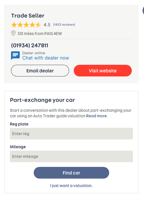
Good Example: Auto Trader
Auto Trader have covered all bases when it comes to helping their customers decide if they can afford that car in their means.
Not only do they have an online instant finance calculator, but they also have a section where the user can value their current car for a part exchange which a lot of people consider during the process.

Where Should I Buy It?
This is one of the very final steps before a buyer chooses to go into your dealership to make a purchase. This is the stage where Anna knows what she wants and that she can afford it, but she wants to buy it from the best place, not only to receive the best deal but the best service as well.
This is where your company needs to stand out from the crowd.
Tell Them Why To Choose You
A lot of car dealers are going to be offering the same car at around the same price, so what makes you stand out? What more can you give them to seal the deal. Showcase your USPs right beside the price so they know the entire package they can receive.

Consider Multiple CTAs
We hope this is the stage where they want to buy, but they might still have a few more concerns that need ironed out first, so make sure you also address this issue with more than one Call To Action (CTA). Some people might want to be sent directly to book a test drive, or maybe speak to a salesperson, or hold that current price. Give them those options so you don’t lose them at the final hurdle.


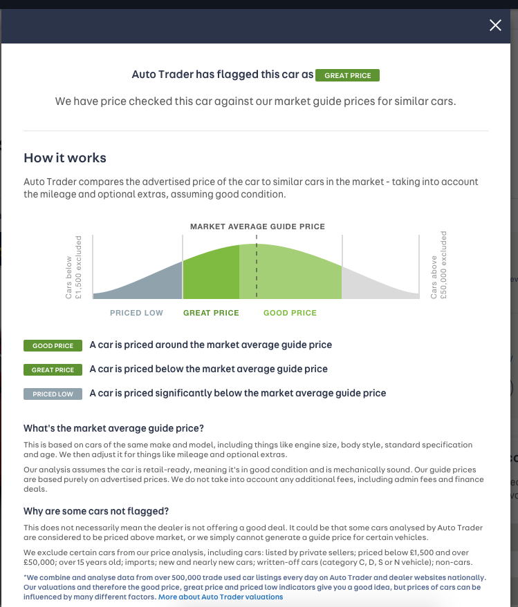
Am I Getting A Deal?
This is most likely one of the final steps, if not THE final step before deciding to step into the dealership. With so much information being only a few taps away Anna is going to want to make sure that ultimately she is getting the best deal from your dealership, whether that’s in terms of price, service, add ons or offers.
If you have a great deal on your site don’t be shy about it showing it off. You can do this by showing the saving vs the RRP of the car, or if you have an offer - show the before and after prices, and by comparing to the industry average so they don’t have to even go elsewhere to check.


If you implement these design elements into your website you will see your conversions drastically improve. Giving your user what they want, where they want it, in the most streamline and easy way possible is exactly what will keep your users on your site all the way through to the final buying stage.
If you are in need of some help setting up a website designed to convert traffic into paying customers, get in touch with Digital Impact today!