Designing a website for your business is a delicate balancing act. But it’s an important balance to strike - according to HubSpot, over half of website visitors stay for only 15 seconds. First impressions matter when it comes to your website. If you don’t impress, you might as well be redirecting your site to a competitor’s page!
Attic Self Storage came to us for a custom web design and build. As a self-storage company based in the hustle and bustle of London, they were competing with big, well-established brand names. They needed to stand out and their website held the key to building trust and making conversions. If their website looked tired, what would their physical sites look like? Could a user trust them to look after their prized possessions?
Their website needed some TLC. It needed to be brought into the modern digital age and streamlined so that users could easily complete their goals - and stay away from the competitors.
Our savvy UX designers and web developers banded together to spruce up Attic Self Storage’s website to improve the navigation and ease of user task completion.
The Challenge
When Londoners are already forking out £700 a month on a single bedroom in a shared flat, they need to be savvy when it comes to storage. Rather than simply giving away all of their worldly possessions, many turn to self storage as a solution to stow away their excess belongings. This squat and expensive flat situation isn’t going away any time soon so the London-based Attic Self Storage isn’t short on customers.
But how does Attic Self Storage entice these potential customers to rent a unit with them?
Attic Self Storage’s website was dated, cluttered, and hard to navigate. It wasn’t mobile-friendly, and given that 40% of their traffic (and rising!) viewed the site on their smartphones, they were failing to provide an engaging experience that would secure those all-important conversions.
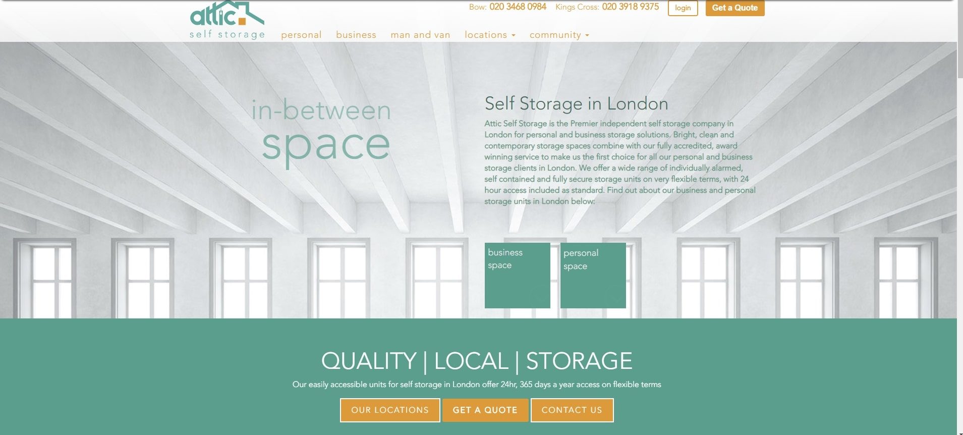
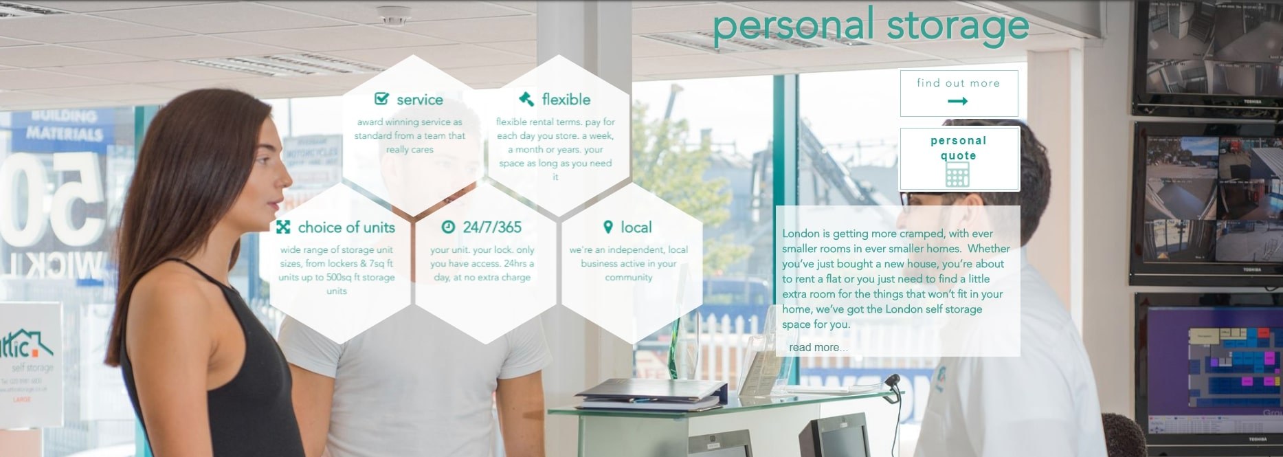
Our challenge was to design and build a responsive, sleek and modern website that would provide a fantastically smooth user experience. The website needed to link seamlessly with their online quote and booking engine, as well as allowing customers to explore the facilities available at their locations and get a quote for their self storage needs quickly and easily.
They needed their site visitors to hang around for more than 15 seconds - and sign up for a storage unit!
The Solution
Our collaborative team of experienced UX designers and website developers came together to build Attic Self Storage a sleek, user-oriented website built for conversions. This process can be broken down into some central elements:
- UX Strategy Workshop
- Drawing Up Designs
- Coding and Testing
Here’s exactly what we did.
UX Strategy
This web development project kicked off with a high-energy user experience (UX) workshop which helped us to determine exactly what Attic Self Storage wanted to get out of their new website and how we’d determine whether it was successful.
During the workshop, we analysed Attic Self Storage’s competitors designs and gained a deeper understanding of the priorities and needs of the home movers and space savers who would be the end users of the new website.
So, what came out of the UX workshop?
User Personas
We carefully composed fictional representations of Attic Self Storage’s ideal customers, otherwise known as user personas. We thought about their potential situation, their likes and dislikes, their needs and their goals. These personas are instrumental for designing a user-friendly, goal-oriented website design.
Competitor Analysis
With an understanding of what works for others in the industry, we identified areas of best practice as well as opportunities to do things differently to stand out from the crowd.
Customer Journey
Armed with user personas, we thought about the user needs and their priority level in order to track the full customer journey. This would inform the most appropriate website design to funnel customers along the buyer’s journey with ease. Users need to be able to see locations, find contact details, calculate how much storage they need, get a quote… and the list goes on!
To be entirely sure we had the needs of Attic Self Storage’s users down to a tee, we carried out Kano Surveys with existing Attic Self Storage customers to determine what they’d expect, like, tolerate, and dislike when visiting a self storage website. When planning a UX strategy, these Kano Surveys provide a fountain of information about the user-ranked top features and requirements to keep in mind.
The responses from the surveys confirmed our assumptions, enabling us to stride on towards developing Attic Self Storage’s overall site strategy.
Design and Creative
Equipped with this information, we produced site maps, agreed on the functionality specs, and decided on the best information architecture to follow. It was then over to the creative talent at Digital Impact to develop wireframes for the site.
These wireframes form the website skeleton, depicting where the major elements of the website will appear, incorporating exciting new features including:
- A postcode checker for users to find the location nearest them.
- A storage calculator to understand what size of storage unit will fit a user’s many boxes and chunky pieces of furniture!
- Seamless integration with the client’s quote and booking system.
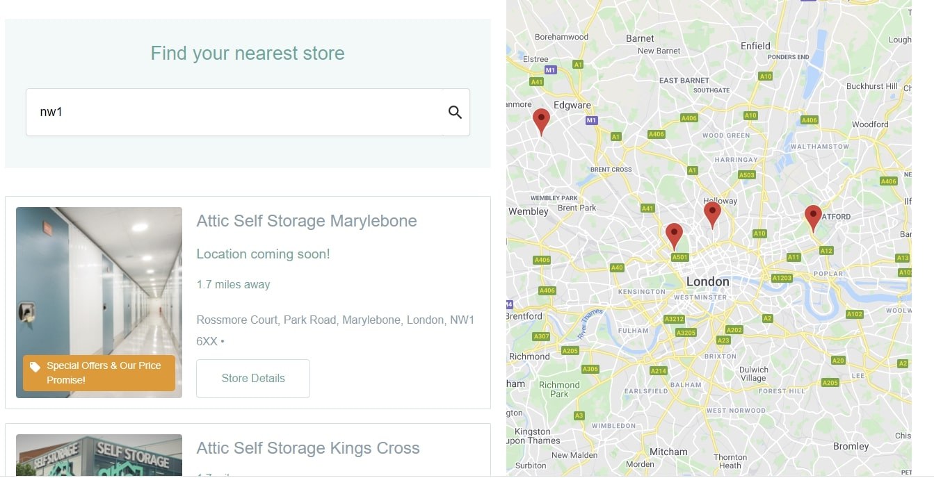
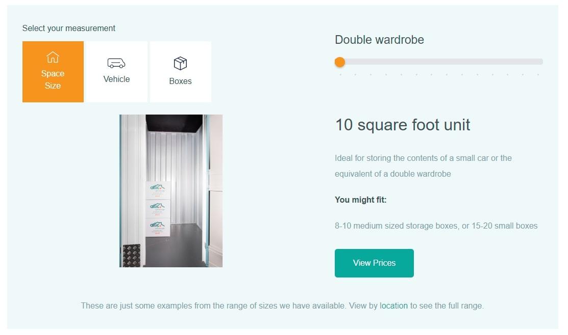
With the structure and flow of the site nailed down in the wireframes, the creative team livened things up to create a full design with colour, branding and graphics to show Attic Self Storage exactly how their new site would look.
Website Development
Our developers brought the web designs to life, building the shiny new site using Craft CMS and a number of other techniques and tools to implement some of the custom features.
As a growing business, Attic Self Storage needed to have the freedom to control their website content as and when they need to. We settled on Craft CMS as it is a flexible system which would allow their team to add elements like new location pages independently rather than relying on an agency to do so on their behalf.
During the development stage, SEO was taken into account rather than solely focusing on users already on the website. With plenty of competition in London, we optimised the website code for SEO by adding relevant keyword-optimised meta data to allow Google crawlers to read the site more easily, as well as ensuring the code was tidy and concise to improve site speed, a major Google ranking factor.
With the knowledge that almost 40% of users were using mobile devices, the developers ensured that it was responsive across the most popular device types. Tailoring the website experience to the device is essential to keep the customer journey smooth, allowing users to complete goals with ease.
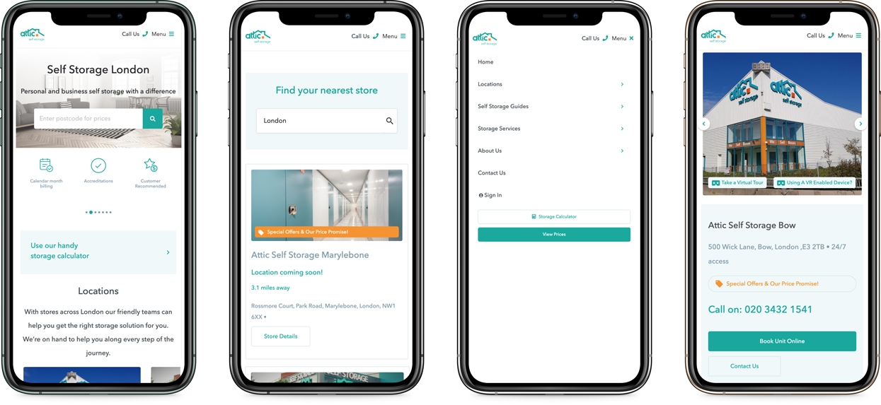
The development team made use of industry-leading tools to strengthen the functionality of new tools. The website’s postcode checker, for example, uses Google’s Distance Matrix API to check how far in miles their locations are from the postcode entered.
As part of their website development package, thorough QA testing was included so that the new site could be rigorously put through its paces, picking up any snags before pushing it live.
The new modern, mobile-friendly and easy-to-navigate website was launched in September 2019 and since then, we’ve been providing ongoing support and maintenance to keep Attic Self Storage’s website running like a well-oiled machine.
The Results
Attic Storage’s new and improved website yielded great results for the business.
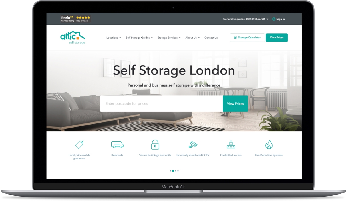
By optimising the code for SEO and implementing a cleaner site architecture, Google is able to crawl Attic’s website far more easily. This in turn has played a role in boosting their rankings, leading to a21.72% increase in users in the 6 months since it went live compared to the previous 6 months.
The user-friendly design has made it more straightforward for users to navigate the site to meet their goals - the average number of pages viewed per session rose by 16.84% in the same period.
The average session duration also rose by 8.22% which demonstrates that users find the content informative and the navigation intuitive.
These great results are just at the beginning of the road for Attic Self Storage - the newly refined, smooth user experience has led to improve analytics stats which Google can use as a positive indicator of the website’s reliability, boosting rankings. And when users click through to the website from Google search results page, they can whizz through the site to meet their goals with ease.